OGEX redesign
Product Design · Telefónica
Design System · Mística
Interaction Design
Figma
Redesign for the Open Gateway ecosystem
Open Gateway Exchange (OGEX) is an internal portal where technical, delivery, product and operational teams manage the API Product Catalog, Application Owners, Applications and Orders. The redesign rebuilt the information architecture, navigation flows, and interface states from scratch, with the goal of reducing cognitive load and making the backoffice operable without prior technical training.
01 Context & problem
The portal had been running for years with serious usability issues. People struggled to understand how it worked and relied on memorized workarounds to find the information they needed. At key moments, it would also fail with cryptic errors that offered no explanation of what had gone wrong. As a result, a critical tool ended up slowing down the very teams that relied on it every day.

02 My role
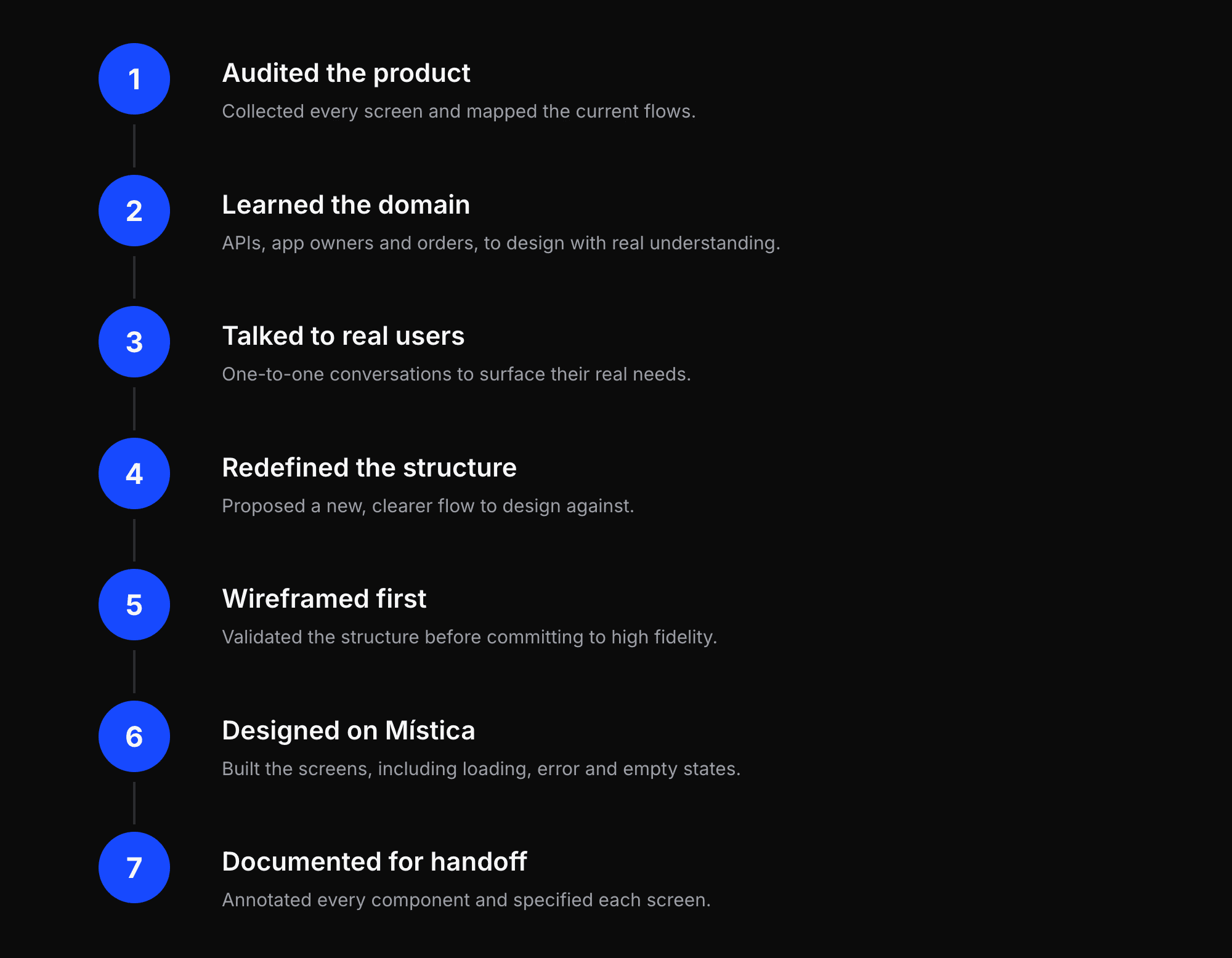
I had the opportunity to lead the end-to-end redesign of the portal. Working closely with the team, I was responsible for the research, information architecture, user flows, UI design, and development specifications. I also gathered the product and business knowledge needed to redesign a complex system that had evolved over many years.


03 Process
I worked following an Agile methodology, embedded in the squad hand in hand with development; organizing the work in Confluence and Jira, iterating in cycles, and delivering design ready to build. The full redesign took about 3 months, kickoff to handoff. The challenge: turn a deeply technical portal into something genuinely navigable and usable; and understand the concepts well enough to make it accessible for very different types of users.
04 Solution & key decisions
A redefined, clearer flow and screens rebuilt from scratch on Mística. Grounding the final screens in Mística foundations made the interface more coherent, maintainable and ready for development, supporting complex work while feeling lighter, clearer and easier to navigate.
A navigation you can trust
A clear, consistent menu, persistent section highlighting, breadcrumbs, and a context-aware back button that returns you to your real position, not a generic list.
Performance-aware UX
Load data only when needed, skeleton states while loading, and component-scoped error boundaries so one failure never breaks the whole page.
Never a dead end
Clear, delimited error messages and empty-state feedback, so users always understand what is happening and why.
Complexity, tamed
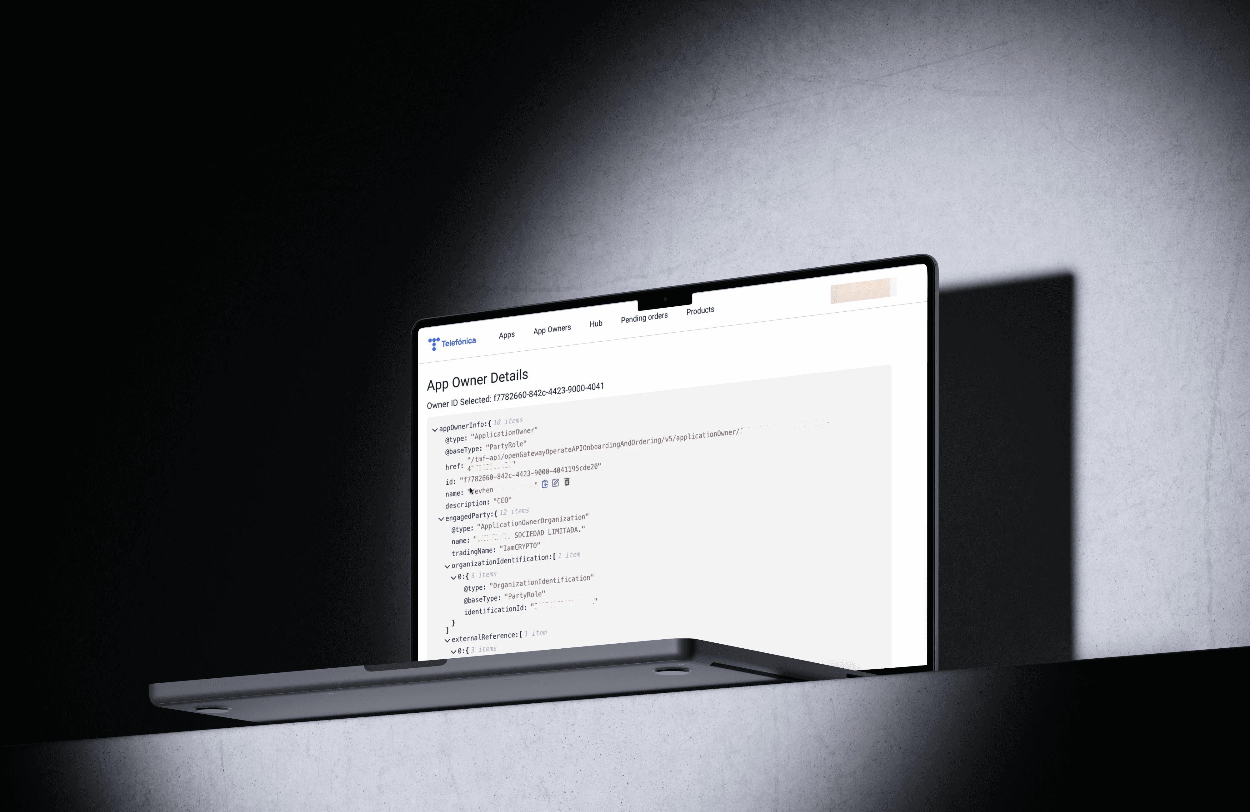
Raw technical data kept collapsed at a second level, so the everyday interface stays approachable for every type of use

05 Impact & learnings
A portal teams can finally navigate.
A visibly clearer experience
The flow far more understandable, the screens far more navigable; now used daily by many different profiles who see a clear improvement over the old portal.
Errors that no longer leave people stuck
The cryptic failures were replaced with clear, specific messaging, so users always know what happened and what to do next.
Cleaner, faster delivery
Because every screen was documented and specified up front, engineering built without extra clarification meetings.
Where I added value
I owned the flows, the IA and the specification that turned an opaque, trick-dependent tool into a guided, accessible experience.


This was a key opportunity to grow as a Product Designer, leading a project where the design, the flows and the discovery were my responsibility. It also changed how I work: I learned to specify designs thoroughly up front so development has what it needs without added meetings. Learning to specify well turned out to be part of the design craft, and part of why the portal succeeded.
Visit also my Behance
OGEX redesign
Product Design · Telefónica
Design System · Mística
Interaction Design
Figma
Redesign for the Open Gateway ecosystem
Open Gateway Exchange (OGEX) is an internal portal where technical, delivery, product and operational teams manage the API Product Catalog, Application Owners, Applications and Orders. The redesign rebuilt the information architecture, navigation flows, and interface states from scratch, with the goal of reducing cognitive load and making the backoffice operable without prior technical training.
01 Context & problem
The portal had been running for years with serious usability issues. People struggled to understand how it worked and relied on memorized workarounds to find the information they needed. At key moments, it would also fail with cryptic errors that offered no explanation of what had gone wrong. As a result, a critical tool ended up slowing down the very teams that relied on it every day.
02 My role
I had the opportunity to lead the end-to-end redesign of the portal. Working closely with the team, I was responsible for the research, information architecture, user flows, UI design, and development specifications. I also gathered the product and business knowledge needed to redesign a complex system that had evolved over many years.
03 Process
I worked following an Agile methodology, embedded in the squad hand in hand with development; organizing the work in Confluence and Jira, iterating in cycles, and delivering design ready to build. The full redesign took about 3 months, kickoff to handoff. The challenge: turn a deeply technical portal into something genuinely navigable and usable; and understand the concepts well enough to make it accessible for very different types of users.
04 Solution & key decisions
A redefined, clearer flow and screens rebuilt from scratch on Mística. Grounding the final screens in Mística foundations made the interface more coherent, maintainable and ready for development, supporting complex work while feeling lighter, clearer and easier to navigate.
A navigation you can trust
A clear, consistent menu, persistent section highlighting, breadcrumbs, and a context-aware back button that returns you to your real position, not a generic list.
Performance-aware UX
Load data only when needed, skeleton states while loading, and component-scoped error boundaries so one failure never breaks the whole page.
Never a dead end
Clear, delimited error messages and empty-state feedback, so users always understand what is happening and why.
Complexity, tamed
Raw technical data kept collapsed at a second level, so the everyday interface stays approachable for every type of use
05 Impact & learnings
A portal teams can finally navigate.
A visibly clearer experience
The flow far more understandable, the screens far more navigable; now used daily by many different profiles who see a clear improvement over the old portal.
Errors that no longer leave people stuck
The cryptic failures were replaced with clear, specific messaging, so users always know what happened and what to do next.
Cleaner, faster delivery
Because every screen was documented and specified up front, engineering built without extra clarification meetings.
Where I added value
I owned the flows, the IA and the specification that turned an opaque, trick-dependent tool into a guided, accessible experience.
This was a key opportunity to grow as a Product Designer, leading a project where the design, the flows and the discovery were my responsibility. It also changed how I work: I learned to specify designs thoroughly up front so development has what it needs without added meetings. Learning to specify well turned out to be part of the design craft, and part of why the portal succeeded.
Visit also my Behance
NEXT PROYECT_
Digital B2B Agent
OGEX redesign
Product Design · Telefónica
Design System · Mística
Interaction Design
Figma
Redesign for the Open Gateway ecosystem
Open Gateway Exchange (OGEX) is an internal portal where technical, delivery, product and operational teams manage the API Product Catalog, Application Owners, Applications and Orders. The redesign rebuilt the information architecture, navigation flows, and interface states from scratch, with the goal of reducing cognitive load and making the backoffice operable without prior technical training.
01 Context & problem
The portal had been running for years with serious usability issues. People struggled to understand how it worked and relied on memorized workarounds to find the information they needed. At key moments, it would also fail with cryptic errors that offered no explanation of what had gone wrong. As a result, a critical tool ended up slowing down the very teams that relied on it every day.
02 My role
I had the opportunity to lead the end-to-end redesign of the portal. Working closely with the team, I was responsible for the research, information architecture, user flows, UI design, and development specifications. I also gathered the product and business knowledge needed to redesign a complex system that had evolved over many years.
03 Process
I worked following an Agile methodology, embedded in the squad hand in hand with development; organizing the work in Confluence and Jira, iterating in cycles, and delivering design ready to build. The full redesign took about 3 months, kickoff to handoff. The challenge: turn a deeply technical portal into something genuinely navigable and usable; and understand the concepts well enough to make it accessible for very different types of users.
04 Solution & key decisions
A redefined, clearer flow and screens rebuilt from scratch on Mística. Grounding the final screens in Mística foundations made the interface more coherent, maintainable and ready for development, supporting complex work while feeling lighter, clearer and easier to navigate.
A navigation you can trust
A clear, consistent menu, persistent section highlighting, breadcrumbs, and a context-aware back button that returns you to your real position, not a generic list.
Performance-aware UX
Load data only when needed, skeleton states while loading, and component-scoped error boundaries so one failure never breaks the whole page.
Never a dead end
Clear, delimited error messages and empty-state feedback, so users always understand what is happening and why.
Complexity, tamed
Raw technical data kept collapsed at a second level, so the everyday interface stays approachable for every type of use
05 Impact & learnings
A portal teams can finally navigate.
A visibly clearer experience
The flow far more understandable, the screens far more navigable; now used daily by many different profiles who see a clear improvement over the old portal.
Errors that no longer leave people stuck
The cryptic failures were replaced with clear, specific messaging, so users always know what happened and what to do next.
Cleaner, faster delivery
Because every screen was documented and specified up front, engineering built without extra clarification meetings.
Where I added value
I owned the flows, the IA and the specification that turned an opaque, trick-dependent tool into a guided, accessible experience.
This was a key opportunity to grow as a Product Designer, leading a project where the design, the flows and the discovery were my responsibility. It also changed how I work: I learned to specify designs thoroughly up front so development has what it needs without added meetings. Learning to specify well turned out to be part of the design craft, and part of why the portal succeeded.